Design System · 2026
Delivering Design System in Code
Design handoff often ends before the experience becomes real. This project closes that gap by building components in a live environment—not static screenshots—so design intent can be reviewed, tested, and refined in a live environment.
It also explores how AI-assisted coding tools can create tangible value beyond generating screen concepts, enabling a more effective bridge between design and engineering through executable, production-minded components.
Static Figma spec
Figma handoff often stops at static frames — layout, color, and type are set, but interaction is missing or implied: states, motion, and how components respond to live data. The embed below is that starting point: a visual spec, not yet a product surface.
RobotCard — Figma design
Open in FigmaBuilding it in Cursor
I used Cursor as the full workflow — from scaffold to documented component. The process breaks into five steps that map cleanly onto how design and code should stay linked.
- Set up React. Start a Vite + React + TypeScript project in Cursor (
npm create vite@latest). This gives you a fast dev server, a real component tree, and a place to iterate on behavior — not just layout. - Share the Figma link. Paste the Figma file URL into Cursor and ask it to implement the component from the design. With the Figma MCP connected, Cursor can read frames, tokens, and spacing directly from the source file instead of guessing from a flat export.
- Fine-tune design details in code. The first pass from Figma gets you close, but real components need polish — spacing that breathes at different widths, expand/collapse timing, hover and focus states, and edge cases like offline or loading. Use Cursor to iterate in the browser: tweak CSS, adjust props, and refine interaction until the implementation matches the intent, not just the pixels.
- Add Storybook. Run
npx storybook@latest initto generate stories alongside your components. Each variant from Figma — nominal, warning, critical, offline — becomes a story you can review, tweak, and share without rebuilding the whole app. - Save the work on GitHub. Push the project to a repo as you go — components, stories, and config together. GitHub becomes the single source of truth for the implementation: easy to revisit, share with collaborators, and link from a portfolio or Storybook deploy without losing the thread between design and code.
The Figma embed above is the spec. Cursor closes the loop by turning that spec into working code, GitHub preserves the iteration, and Storybook makes the result reviewable on its own.
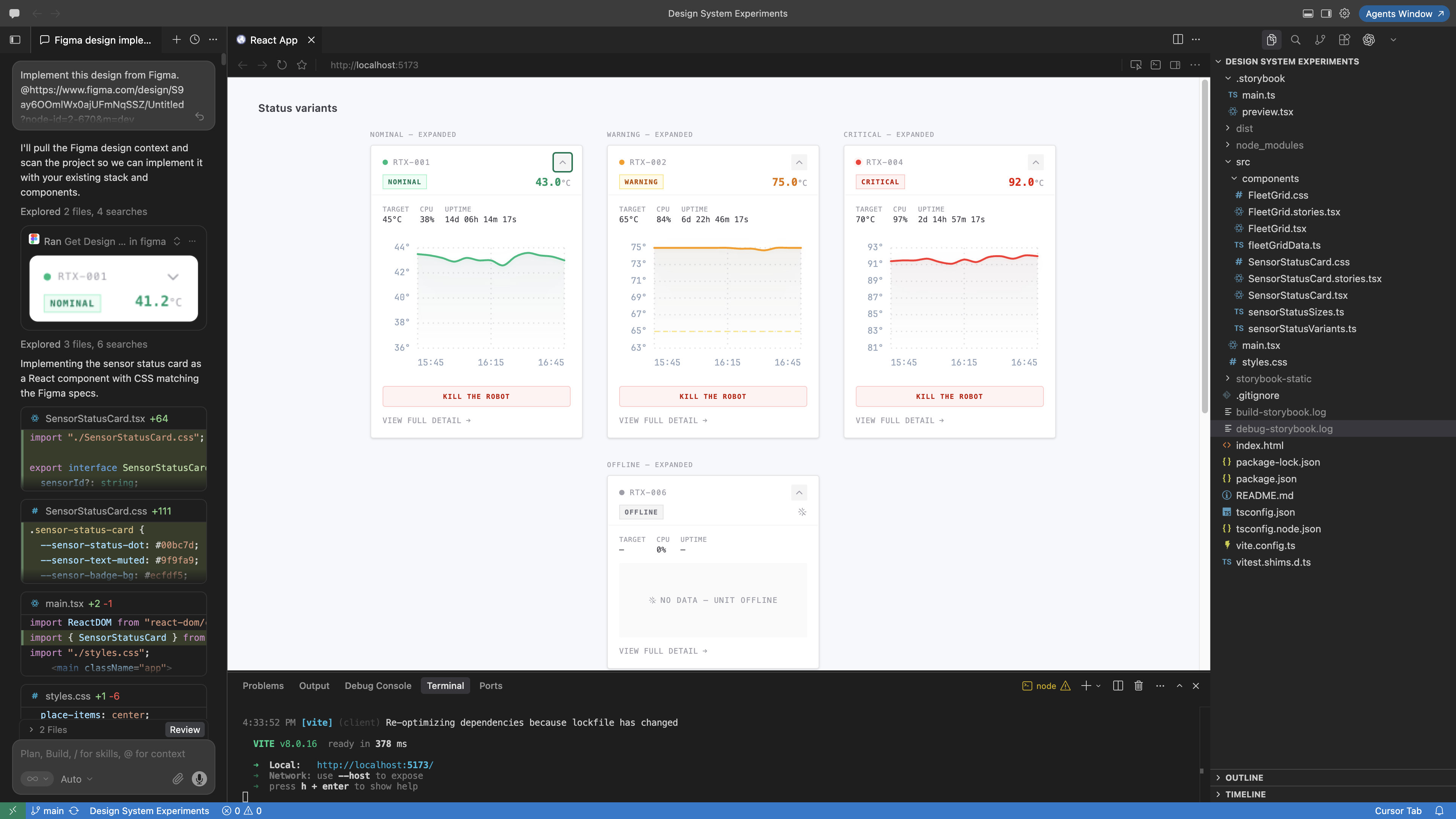
Reviewing in Storybook
Storybook is where the component becomes a self-contained product surface you can inspect, test, and share — not a single screen buried in a larger app. Open a story to see a variant in isolation, use the Controls panel to swap props at runtime, and switch to the Docs tab for usage notes and API reference. The Design addon embeds the original Figma frame side by side, so you can compare implementation against the source without leaving the browser.
Try the component in the embed below — expand a card, switch variants, and notice the live interaction that a static Figma frame cannot show.